When seconds count, the brand has to work harder.
Brand Strategy
The brief called for a brand identity built for emergency services — where recognition isn't a nice-to-have, it's the whole job.
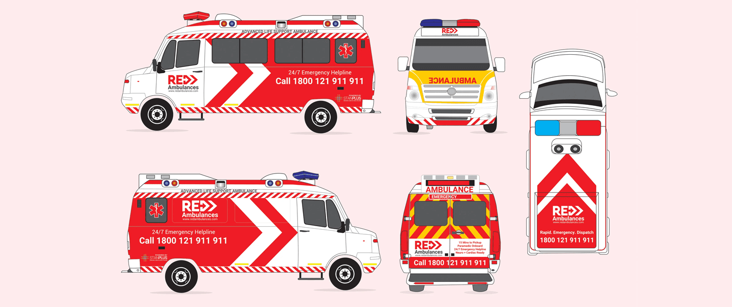
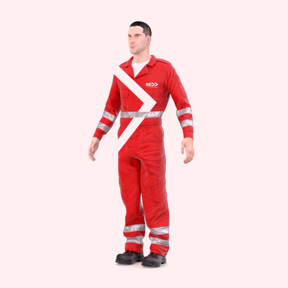
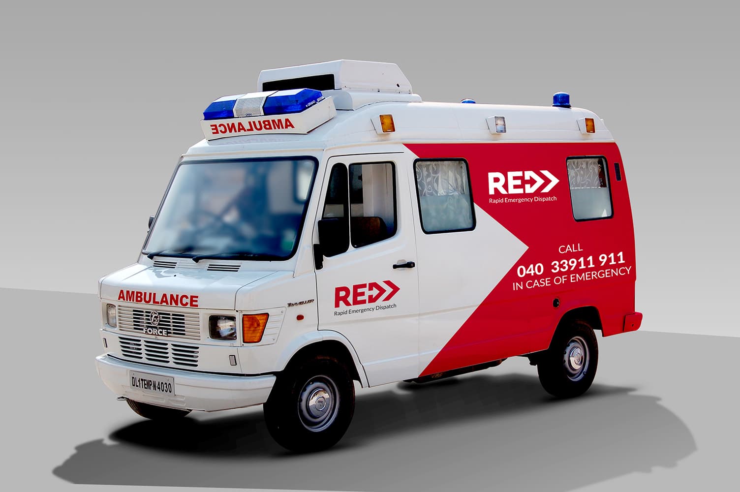
REDD needed a visual system that could command attention on a moving ambulance, read clearly on a uniform, and carry authority across every surface it touched.
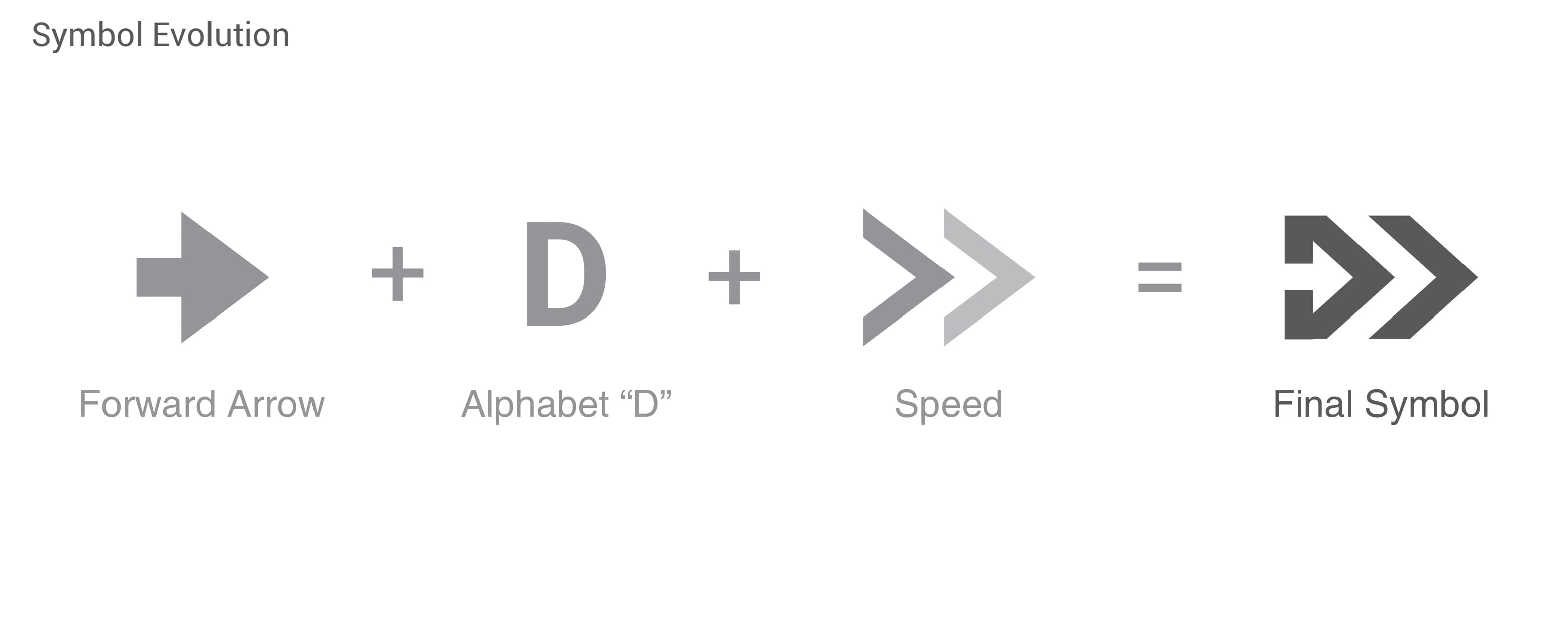
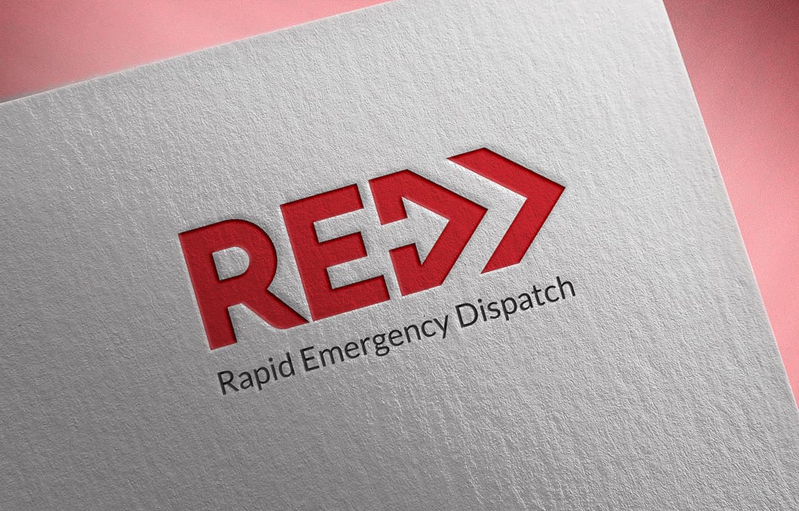
One mark. No ambiguity.
Visual Identity
The symbol was refined through multiple iterations — each round stripping away anything that slowed recognition. The final mark is bold, directional, and built to scale from a lapel badge to the side of a vehicle without losing its edge.
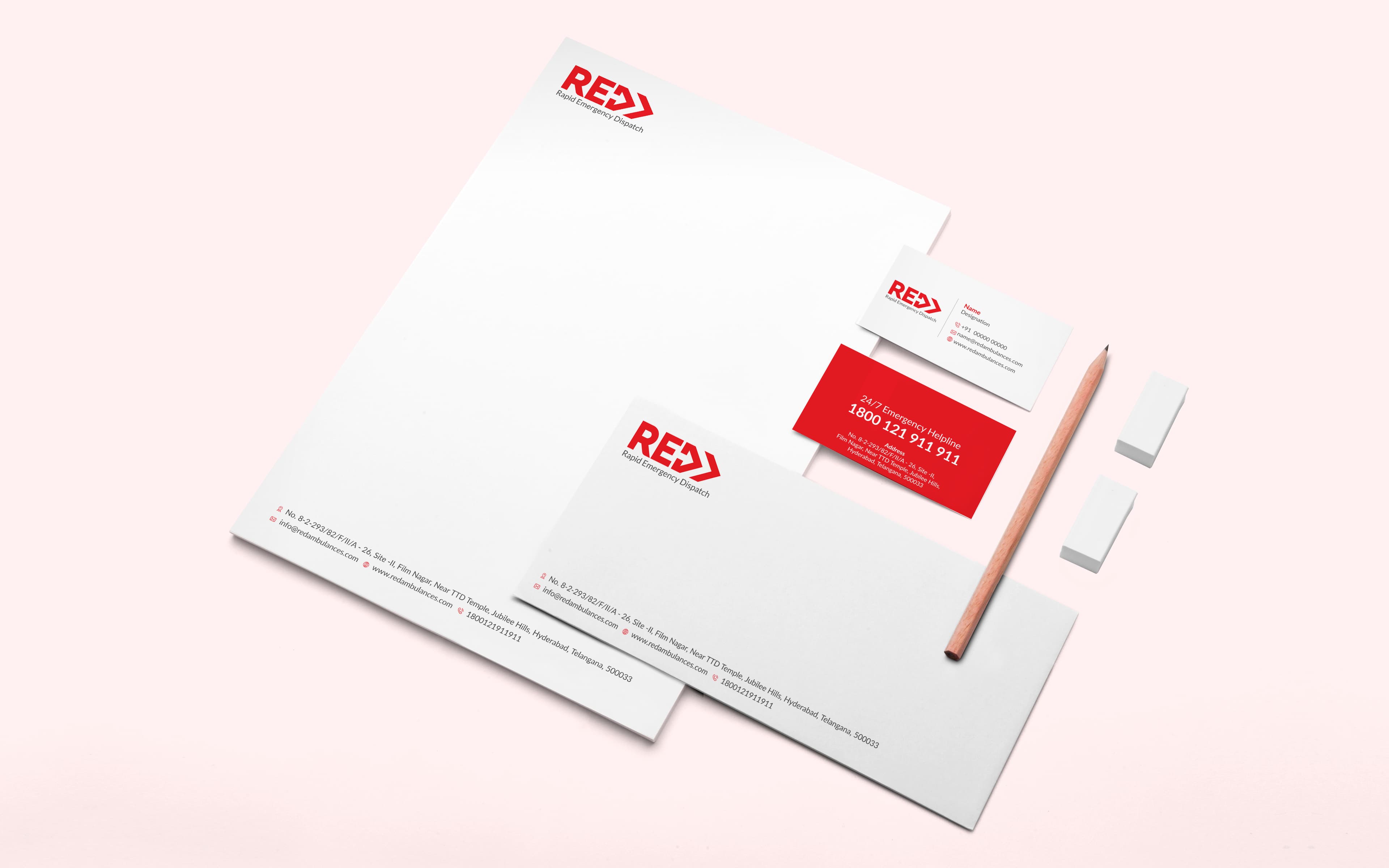
The system extends across stationery, fleet, and uniforms as one coherent, high-visibility identity.